-
COMMUNITIES
- COMING SOON
- SEATONVILLE
- ORIGINS2
- GREENWOOD
- UNIONGLEN MARKHAM
- LAKEVIEW VILLAGE
- NOW OPEN
- HONEYSTONE
- THE CASTLE MILE
- UNDER DEVELOPMENT
- ANGUS GLEN
- PRINCE EDWARD COUNTY
- ALL COMMUNITIES
-
ABOUT
-
DECOR
-
HOME CARE
- MOVE-IN READY
- GALLERY
- CONTACT
- REGISTER
- BLOG
- MAGAZINE


CHOOSING THE RIGHT NEUTRAL PAINT COLOURS FOR YOUR HOME
Did you know?
Eric Clapton’s hit song White Room was inspired by the repainting of his London apartment? No, not really, but choosing the proper neutral tones for your space can be a similar surreal journey.
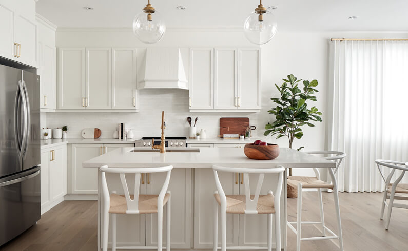
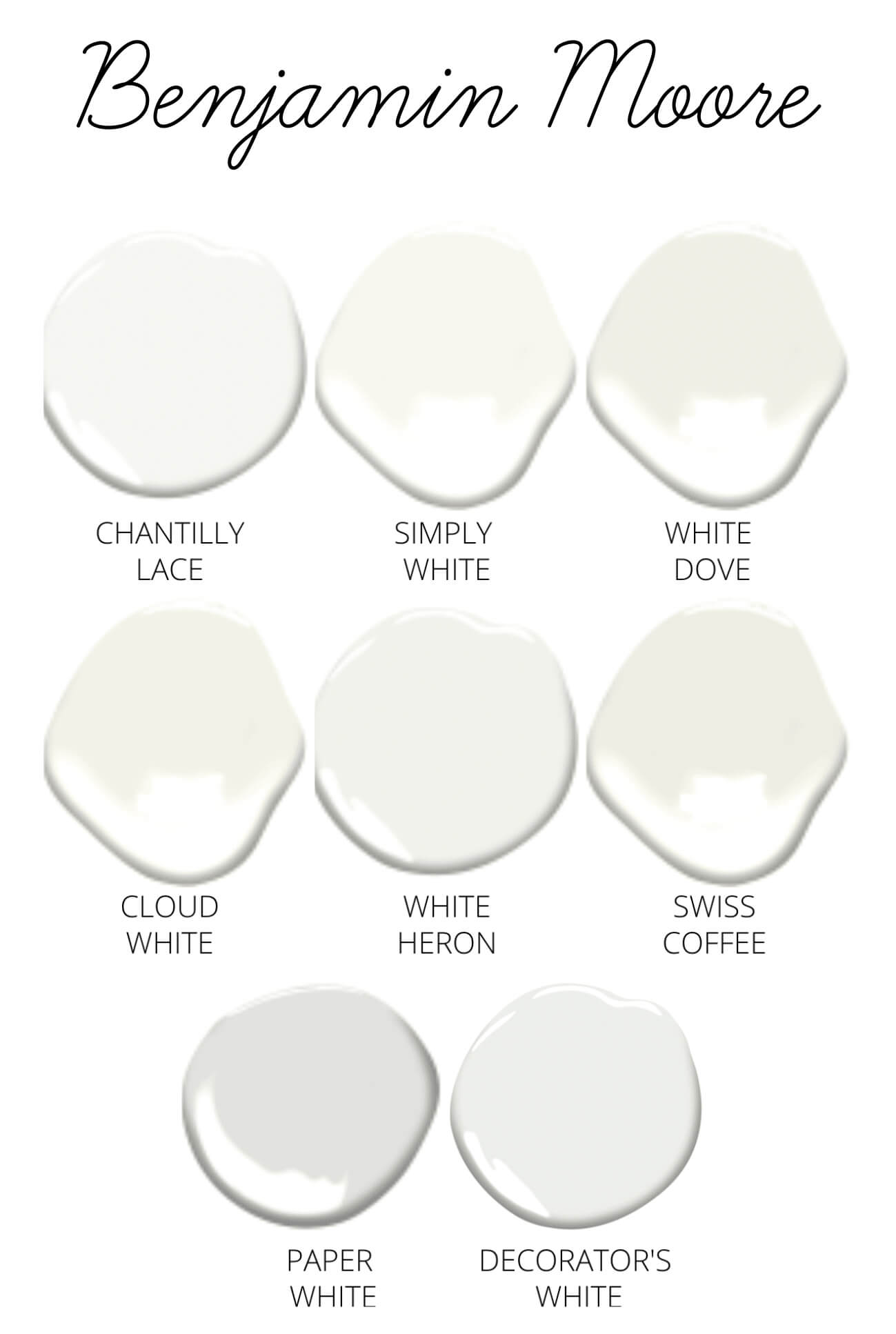
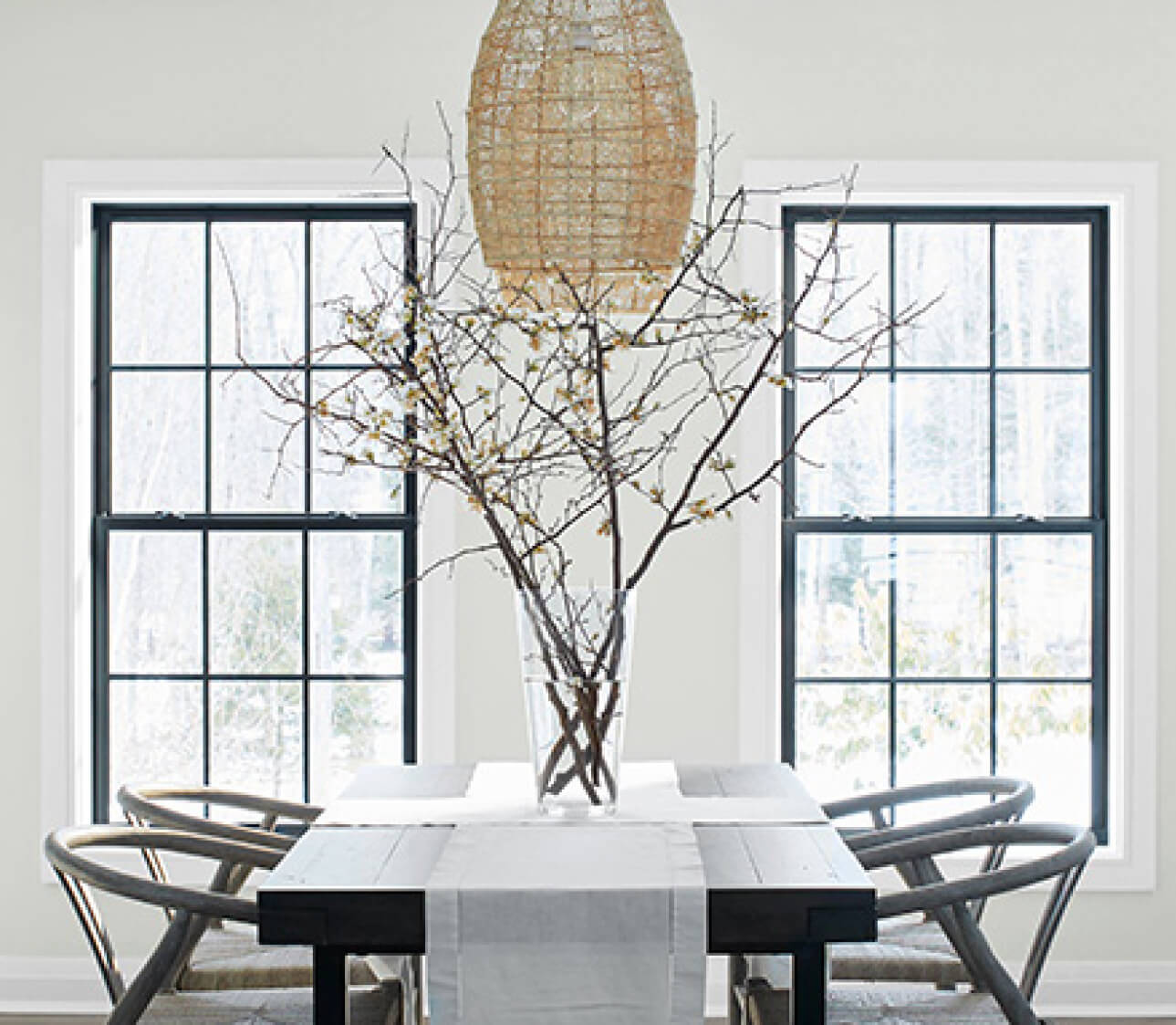
Benjamin Moore has over 150 shades of white and grey. Sherwin Williams has over 50. Farrow & Ball, over 20 of them. Suffice it to say that choosing the simplest paint colours isn’t simple at all. In fact, it’s a highly intricate process that must be carefully considered when giving your spaces a facelift. Texture, undertone, temperature and even the direction your spaces face are crucial elements that will drastically influence which neutral tones will work best. But where do you start? It may seem dreadfully overwhelming at first, but there are a few simple concepts to keep in mind when evaluating the plethora of tones out there. Read on to discover our top tips on choosing your perfect neutrals!
THE UNDERTONE
Primary, secondary, tertiary or any colour beyond these 3 dimensions is a mixture of one shade or more. And neutrals are no exception. When it comes to white and grey specifically, there will always be hints of yellow, red, blue or even green. This residual influence of colour is called an undertone, and can range from being almost invisibly subtle to surprisingly overt. Why does this matter? Well, it’s these fine details that will make or break any interior space. The key here is to choose a neutral with undertones that complement the established elements of your space, be it trim, decorative features or even ceiling colour. When deciding between two seemingly similar shades, it’s useful to create several paper paint swatches and compare them next to each other in your space. This will highlight their minute differences, and when done at varying times during the day, will accurately represent the dynamics of each colour with changing levels of daylight.
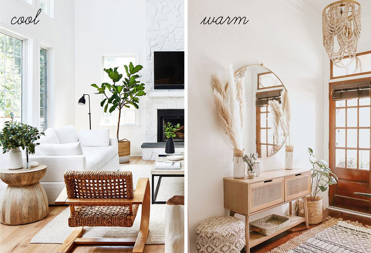
THE TEMPERATURE
Who would’ve thought that climate could have such a profound effect on the expressions of colour? Hot and cold have their own unique subtleties when interacting with natural light, so it’s no surprise that temperature is in fact an artistic description of colour. Light in warmer climates tends to have more vibrant hues of red, yellow and orange while cooler environments lean towards acute shades of blue or green. This is important to consider with undertone as it is critical to strike some sort of balance. For example, using a neutral shade with blue undertones in northern areas will greatly emphasize an already cold feeling, while the opposite is true for warmer southern locations. Moreover, the direction your spaces face will contribute to the colour temperature of your interiors, depending on how much natural light is let in. Which may seem like a ridiculous thing to consider, but becomes immediately apparent when viewing sample colours in your spaces.
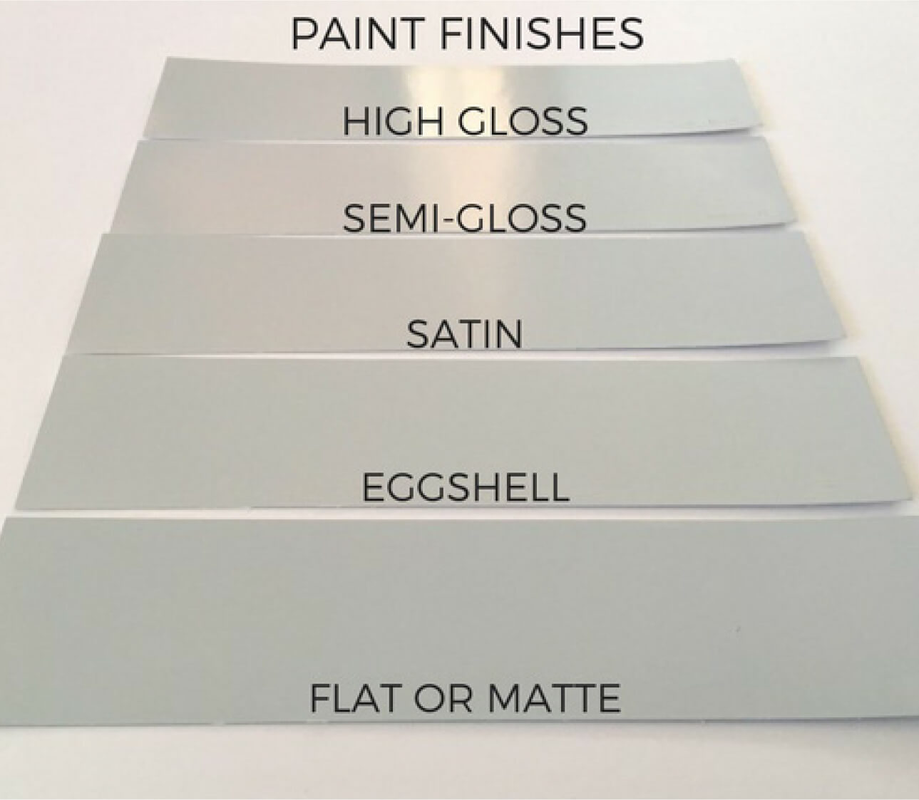
THE TEXTURE
There are so many paint textures out there and, much like undertone and temperature, all have a distinct way in which they interact with light and the surrounding environment. Take a gloss finish for example. By design, it’s meant to reflect natural light and spread it around for an airy sense of space. Conversely, a matte finish will attract and absorb light to create a feeling of density and coziness. In today’s world of gloss, semi-gloss, matte, eggshell, satin and so many others, choosing the right texture is no easy feat. A simple rule to follow is this, “The higher the shine, the higher the sheen; and the higher the sheen, the more durable it will be”. Take differing samples swatches into your spaces and compare them to start your decision-making process on the right foot, taking into account the points mentioned above.
THE EXPRESSION
A renowned mountaineer once said, “One cannot estimate the stature of the stone until they literally rub noses with it”. This could not be more applicable when it comes to choosing neutrals. And though you may have found the perfect shade online or in a catalogue, there’s no telling how it will be expressed when it’s finally in your home. Therefore, it’s crucially important to bring many sample swatches into the space in different undertone, temperature and texture. Better still, test your shades right on your walls for the most comprehensive approach to finalizing your next neutral tone.
For insights into this year's hottest décor trends, be sure to read the latest issue of the DECO Décor Magazine today!


8:30AM - 5:00PM